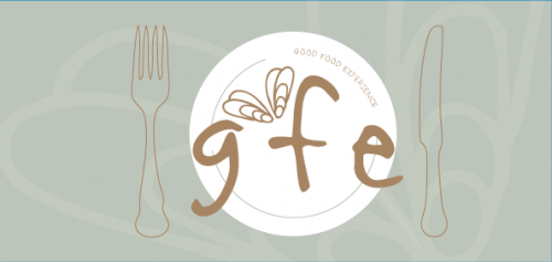
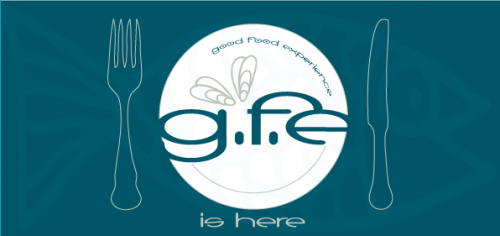
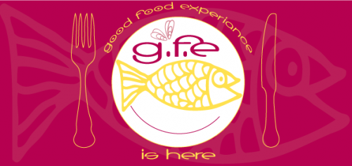
I’m appealing to you for help with my next assignment… again. We have to design a small brochure for a restaurant opening and this is just the front cover. The assignment is quite prescriptive in terms of text content but the style of food that the restaurant serves is really up to us. I’m going for tappas style that’s fast and fresh. I know each of my designs are a variation on a theme but I’m really not sure which one to go for. Can you help?
Design Dilemma – Help Please
Comments
7 responses to “Design Dilemma – Help Please”
-
I like the first one. For me, it’s the lettering that makes the difference. The second and third have cleaner lettering, like an actual font. It feels a little more formulaic because of this.
The first one has a less formal font. Like someone did it with brush strokes. To me, this one feels more welcoming.
I know nothing about the mood you are going for or the food. That’s just my quick analysis.
-
I went back and looked again and I think the coloring on the first one is more welcoming, too. I also like the less-busyness of it (like my made up word?). It’s definitely my favorite. It’s more soothing. The other two are more stimulating.
-
Wow! These are all great, Libby! 🙂 Ohhhh, I’m actually kind of mixed with elements of the first and third. I know, I’m not much help. When you said tapas style, I immediately thought of Spain, wine, olives, red, variety, but not predominately fish. The third design really makes me hungry! 🙂 I like the Good Food Experience and Is Here around the plate in number three and the casualness of the font and background of number one. Number three is my overall pick, it has a fast fresh feeling to me, but I’m not a designer, I only gobble tapas! 🙂 Thank you for letting me play! I love seeing your design process! I can’t wait to find out which one you use!
-
I like number one the best. The fonts and colour give it a laid-back feel. Number 2 feels too “cut-n-paste/I got this off the interwebz”. Three is nice but it suggests a seafood place rather than a tapas bar. Even without knowing it was for a tapas place, I still prefer number 1 overall. 🙂
-
What fun! I love the vibrant colors of the third one, but like the simplicity of the design in the first one. (How’s that for wishy-washiness?!) And while I’m at it, the second one is pretty, too!
GFE to me says “local” food whenever possible, no heavy sauces… taste explosions.
-
I like the third one. Then no. 1, then no. 2. 🙂
-
I like the third one cause it keeps catching your eye and its bright and colourful and cheery.


Leave a Reply