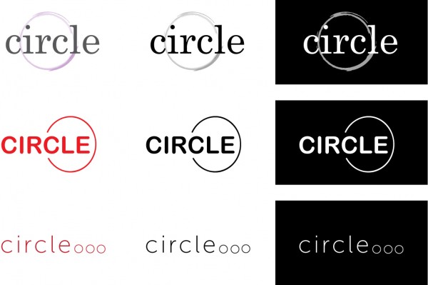
Thanks so much to everyone who helped me choose my final 3 circle logos. I think choosing 3 was actually harder than creating 40. So these are the 3 I went with for a few reasons. I was very attached to the top one, I kind of liked the painterly circle that reminded me of a wine stain so I thought that fit the restaurant theme. The problem is it wasn’t as successful in black and white and then reversed. The other two I chose because I thought they were clean and minimal and they both translated well in black and white and reversed. I think though, my favourite would have to be the bottom one. I like the three little circles, almost like an ellipses and since I’m so fond of hidden meanings I like a restaurant logo that promises ‘but wait there’s more’.

Comments
3 responses to “Circle logo :: my final three”
Great choices. I like your reasoning on the last one. I still love the first one. I think I’m in love with the painterly circle as well. Mostly clean lines, with just enough off to make it feel like it has the personal touch.
Those are nice, strong choices, Libby! Did you ace your assignment?
Not yet! We have about 11 ‘mini’ exercises to do over the first 5 weeks. They are so time consuming that they are hardly mini at all. The worst of it is that we are getting no input so we are all just stumbling on blindly. That’s why I keep posting it to my blog.