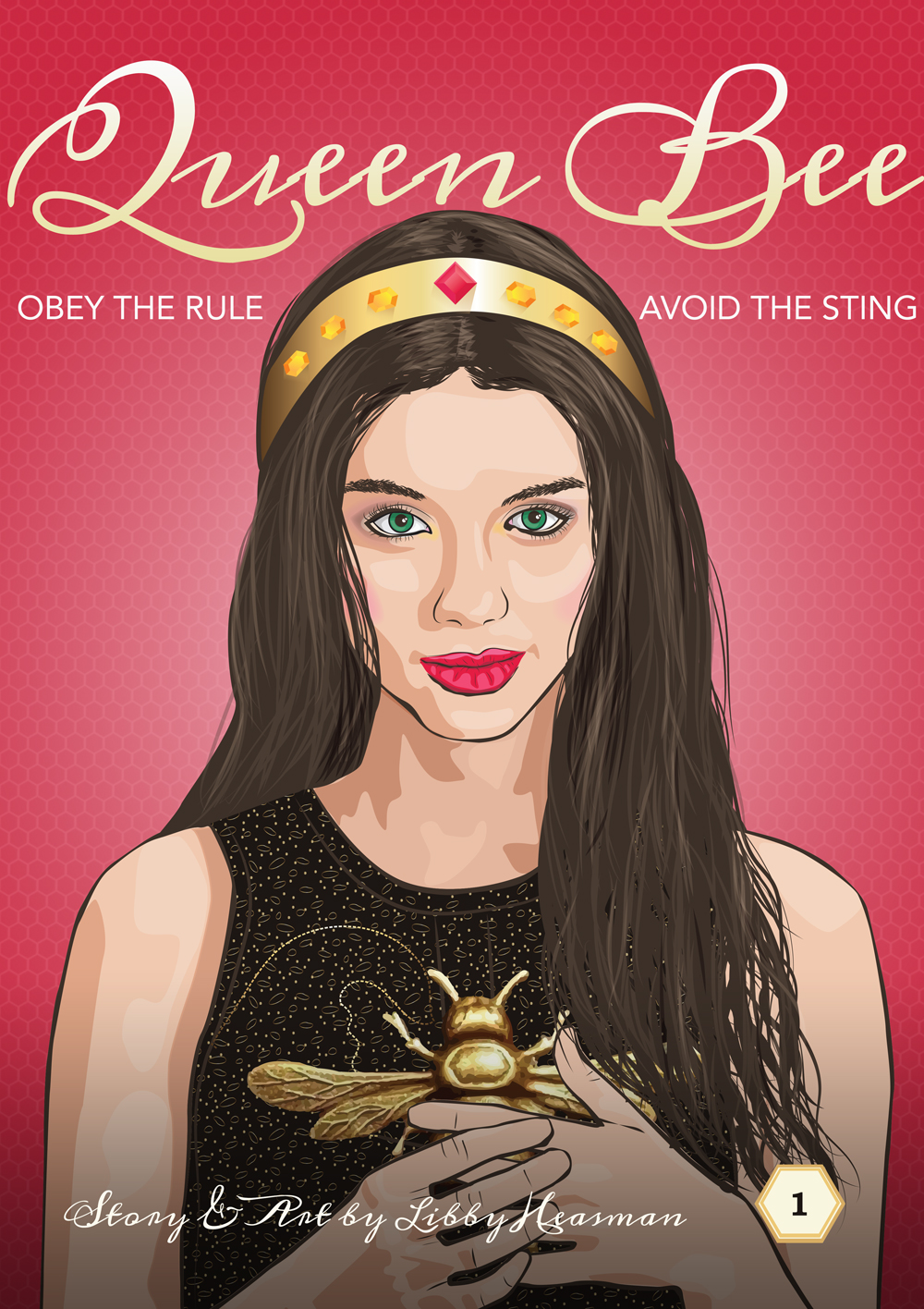
This is a book jacket cover for a project I did at Uni last year that I have been wanting to share this with you for a while now. The brief was to design a piece for a fictitious media franchise, which could have been a TV show, movie, animation or graphic novel. I thought it would be fun to tackle the graphic novel. My inspiration came about as my boys’ are obsessed with manga and was watching ‘Reign’, so my graphic novel was titled ‘Queen Bee’. I set out to see what it would take to illustrate in Illustrator. Oh my! I did not know what I had set myself up for and many many times I almost gave up but I am very glad I persisted.
There were two tutorials I used to get me started. The first one was Creating a Photo Inspired Vector Artwork in Illustrator from Digital Tutors. The tutorial was great but the detail in the illustration was way more than the style I was aiming for and that’s when I found Vector Portraits for Beginners on Tuts Plus. Sharon Milne, who leads this tutorial is so good at explaining the process and I learned many great tricks along the way. I did this tutorial from beginning to end before attempting my own illustration.
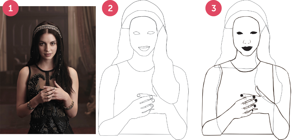
STEP 1 – I started with the image on the left which is a photo of Adelaide Kane from the TV series ‘Reign’, she had a nice intense gaze that I wanted to try and reproduce but also her hand position made it look like she had something to hide and I felt I could make use of that.
STEP 2 – at first I just drew the basic shapes of my figure. The torso, hands face, head, hair and the basic outline for the eyes and mouth. This was a good way to work as these outlines are used repeatedly as you progress with the illustration, especially the eyes and mouth.
STEP 3 – I created solid shapes for the eyes and mouth. I also drew in the nose and the creases on the hands. It was also the point at which I created the line art, which entailed drawing the same shapes as the basic shapes but slightly smaller and then using the Pathfinder Minus Front tool to create a single shape. Doing it this way meant the lines are more realistic than if I had just applied a paintbrush stroke. Once this was done I use the Shape Builder tool to remove any extraneous areas and join some shapes together.
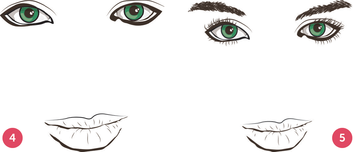
STEP 4 – I then set to work on the eyes, this included extending the shape to make them more feminine, adding the eyeball and pupil, the reflection in the eye. It also meant creating the waterline and the crease of the eyelid as well the shadow that appears over the eyeball. These were drawn using the pen tool and applying a brush stroke that I created before I began. I also added the lines and details to the lips as well as the shadow at the bottom of the lips.
STEP 5 – The final detail for the face was the eyelashes and the eyebrows. These were done with the brush tool using the brushes I had created at the beginning of the process.
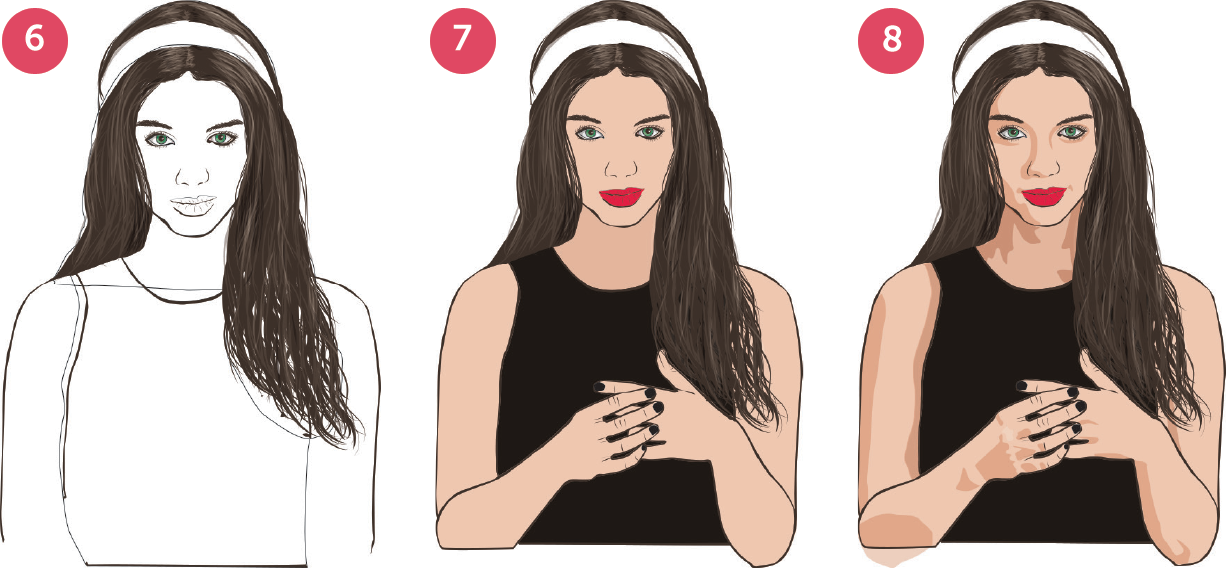
STEP 6 – The next step was the hair and this was done using the brush tool of varying stroke weights. The biggest challenge here was the fact that she had some hair behind her and some over her shoulder. My solution was a very strange clipping mask that somehow seemed to work. The highlights and shadows in the hair were achieved by adjusting the opacity and blending modes over using different colours.
STEP 7 – with most of the detail there I began to block in the base colour of the skin, dress and lips. For the neck used a slightly darker shade since it was already in shadow. Having already created outlines of the lips made this easier and only a few adjustment were necessary.
STEP 8 – then I used the pen tool to trace around the dark areas of the original image and filled this will a darker skin tone. Again the neck shadows are darker than the rest.
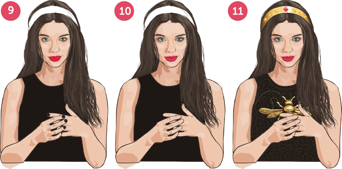
STEP 9 – next was adding the highlights and this was also done by tracing around the original image with the pen tool. There is a slight opacity applied here as my initial attempt made the light contrast too much and it became distracting. The highlights of the neck are the same colour as the base colour of the rest of the face.
STEP 10 – I then started adding the final refinement details to the face, which included highlights and shadows on the lips as well as two shades of eyeshadow that was achieved using the feather effect. I added some pink on her cheeks to give her some colour.
STEP 11 – the last step was adding the details, bringing in the bee, creating the crown and the jewels on it as well as the subtle details in her dress.
I estimate the whole process took about 35 hours – I’m not sure I’ll do it again but I did love the final outcome.
P.S. And you know what, I’ve just realised I left her fingernails off the final image – I guess I better go and fix that.
Comments
2 responses to “Illustrating in Illustrator :: not for the faint hearted”
This is fantastic, Libby! Love it!
Thank you Eileen – it definitely was a long process. It’s so nice to hear from you again!