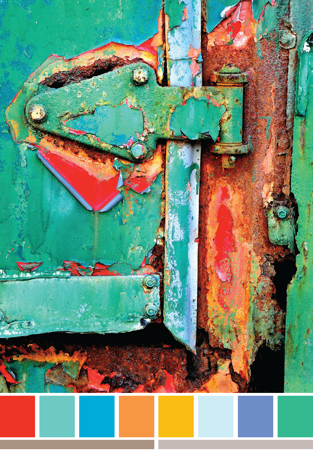
People who know me well, know that I’m a huge fan of colour palettes. Nothing is more lovely to me than a curated collection of well placed colours. I have a whole Pinterest Board devoted to colour palettes for inspiration.
Welcome to the first (of many I hope) post just for palettes – but with a little difference. My problem with most inspirational palettes I collect is that they have a small number of colours (5 usually) and sometimes the colours, while they look amazing, are tonally equivalent which makes them difficult to use in a lot of my design work when I’m looking for contrast. The other problem is that I like to include neutrals in my design work and am always searching for the perfect brown or grey. This quest combined with my obsessive pinning of rust and paint texture images has inspired me towards creating my own palettes, since much of my theme design work starts with an image for both colour and motif inspiration.
There are a few rules I’ve set for myself:
- Each palette will have a minimum of eight colours all derived from the texture image
- The complimentary brown and grey (at the bottom of the palette) are hand mixed using this very cool technique I learned in the Skillshare class Introduction to Surface Design: Creating and Mixing Patterns (affiliate link) by Jenna Frye, my current girl crush.
- There is a good range of contrast in the colours.
It was easy to follow the rules with this amazing image. I’ll see how I go and I hope you keep me on task. Also let me know if you use any of these palettes for your projects.
Quick question though: do I include hex codes for each colour or leave them out? I’m undecided if they are useful or not.

Comments
2 responses to “Colour palette :: texture #1”
I really love this one! I might have to come up with a painting idea which uses this color palette!
What a fantastic image for colour inspiration!