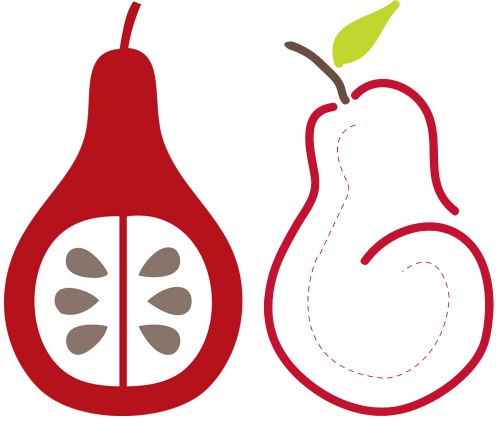
Hi friends! So once again I’m calling on your help with something I’m working on. Remember how I said I was getting serious about my web work? Well I’ve just registered my business name – Crimson Pear – and now I’m trying to create a logo. I always thought that a pear would look nice on a logo! So here’s what I’ve come up with so far. The right one was hand drawn on my iPad and ‘enhanced’ a little in Illustrator and the left one is all Illustrator. I don’t want to influence your choice so I won’t tell you which one I’m leaning towards. Neither are finished so feel free to critique, comment or make suggestions. I can’t wait to hear what you think.
Two Nice Pears :: Help Me Choose
Comments
7 responses to “Two Nice Pears :: Help Me Choose”
-
While I think they are both great, I think the solid one has more pop.
-
Libby you are a creative gal! I prefer the pear on the left (the all illustrator one). It is not that I don’t like the other one – it is just the one that I was initially drawn to.
-
Hmmm .. I like a combo of both … the pear shape. green leaf and brownish branch of the right, but the inside color and seed graphics of the left 🙂
-
I have written this 3 times and so this answer is short. The one on the right. The left looks a little Christmasy. Maybe try the one on the right with a little wider brush.
Thanks for your help in the forum.
-
I am favoring the image on the left for a business, although i like both. For some reason, the image on the right brings to mind a pregnant woman. I am probably out of my mind, but there you go.
-
Hi there,
I’m dropping by from BYW.The fact is that these images work well together, side by side and I feel they loose a little of their impact when standing alone.
The pear on the left is indeed a bold, clean graphic, yet I am afraid I would find it boring on its own. It would need a great contrasting font, maybe something in a quirky casual cursive, similar to the lines and feel of the pear to the right. i would probably experiment with green or taupe (like the seeds) fonts to keep it fresh. So a bold static image ‘paired’ with an interesting handwriting font would work for me.
Having said that, my eye kept being drawn to the pear on the right. I found it more interesting and it revealed a more creative designer mindset, but on it’s own I think it would be too flimsy; it needs some weight. Maybe experiment with thicker lines or use it between the words ‘crimson’ & ‘pear’, as one long attached visual, or even in place of one of the letters themselves (‘o’, maybe). The font used with this image as it would have to have a substantial feel to contrast and ground the image.
I believe that the font you choose, for both these images will make or break the logo. Maybe it was my training, but I love the challenge of using typography as the main visual to represent the meaning behind the logo.
By the way, the colour combination with that great red along with the taupe and just a touch of that chartreuse green work wonderfully. Even the proportions feel right.
I hope this helps and I haven’t overstayed my visit by leaving such a long comment. As a graphic designer myself, I just can’t help getting into details about these kind of observations (occupational hazard, I guess).
I hope you show us your finished logo when done.
-
I vote for the one on the left, gorgeous!

Leave a Reply