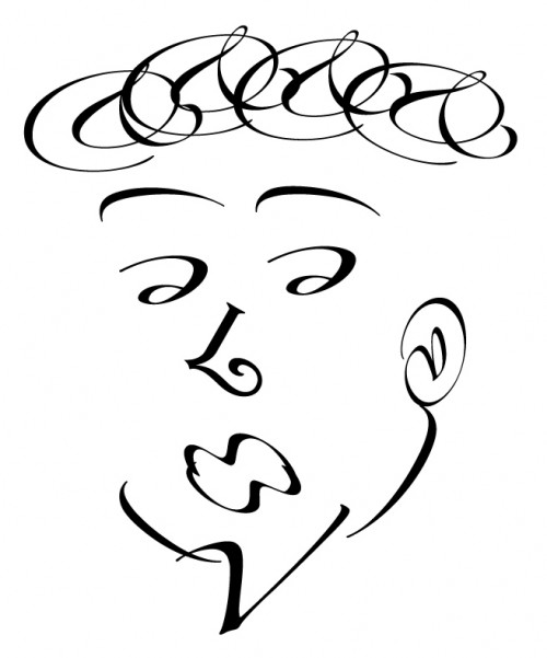
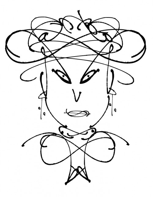
Things have been a little quiet on my blog front… apologies. I’ve been settling back into normal work hours, fighting a cold and trying to make a start on my first Uni assignment which is due in a couple of weeks. This semester I’m doing Digital Publishing and Typography and part of my first assignment is to create faces out of fonts. We are not allowed to distort the characters but we can rotate, scale and reflect. Here’s two that I have come up with. My snobby man and my rich madam. The snobby man was my first attempt and I sat down to attempt a ‘pretty girl’ and he sort of evolved. My rich madam was my second attempt at a ‘pretty girl’. She may not be pretty but she doesn’t care because she’s incredibly rich! I’m not getting as much help from my fellow students this semester so I might appeal to you for a little feedback from time to time. I hope that’s OK. Feel free to comment on these two.
Cheers,


Leave a Reply