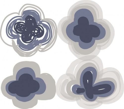
I took my desktop wallpaper image and ran it though Adobe Ideas to produce this swatch. The red, by the way, is part of the logo but I kept it in there. I do like the combination with the red, it brings to mind Ralph Lauren ads – I’m not sure why that is. Since I am a little more focused on blues this week I removed the red from my scribbles.
It started with the top left and a fine ‘pen’ selection and then I just kept making it thicker and thicker. I selected the opacity by accident and then I really liked the overlaps on the two on the right, they just add another dimension. I might see what I can do with this scribble in Illustrator.


Comments
One response to “Seeing blues :: design scribbles”
These are fun. I hope you plan to show us what you end up doing with them.