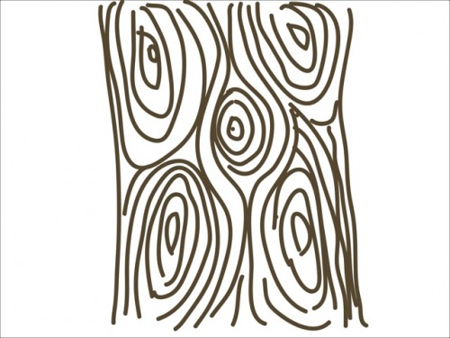
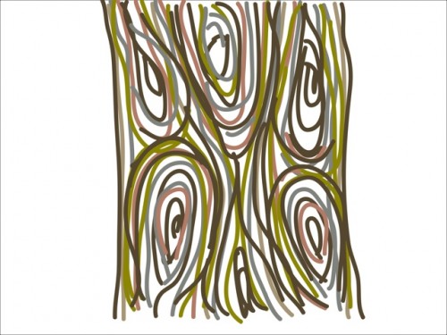
Here’s my latest Adobe Ideas scribble. I had the idea in my head that it would look perfect with a single colour (top) but once I got going it didn’t exactly turn out as I imagined – well does it ever? It’s also quite hard to draw with your finger no matter how thin the selected line. So I tried a variation with colours taken from the wood photos in my previous post. I think this is a little bit fun and I’m sure I could do something with it. I’m actually more fond of the bottom of colour image as it looks like ribbons flowing in a breeze. Which do you prefer?


Comments
One response to “A wood scribble”
I think they’re both great, but I prefer the bottom one. The top one seems a little too symetrical to me. It kind of feels forced into the shape, less natural.
Does that make sense?