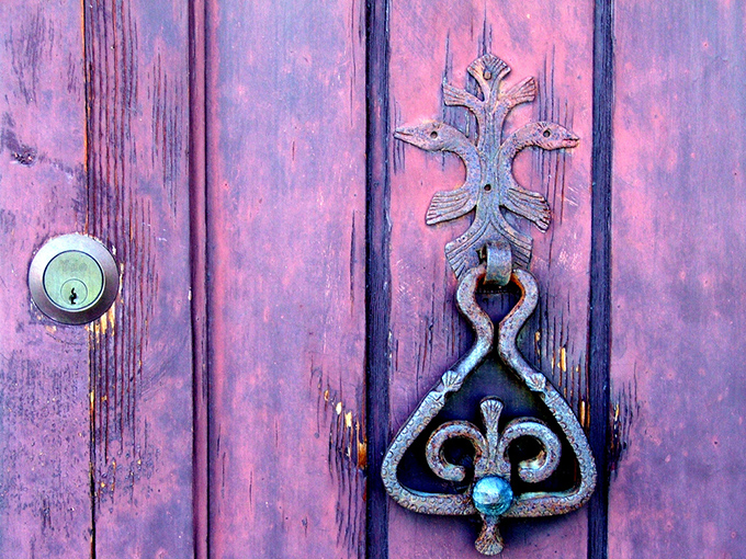
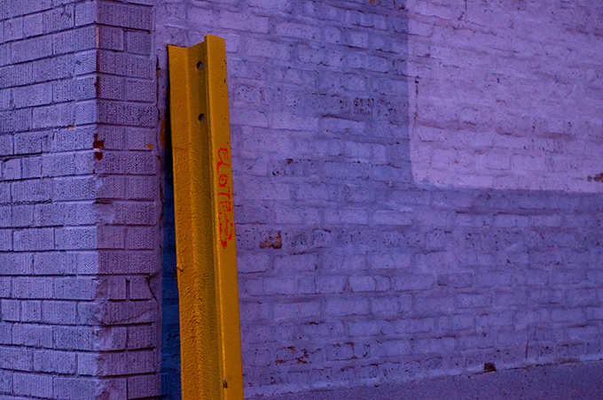
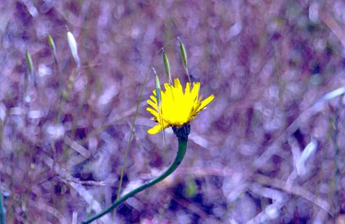
I was somewhat inspired this week by Pantone’s Fashion Color Report for Fall 2012. Let’s just say it’s a good thing that Pantone are so very good at colour because their website is almost unusable! I would also love these big organisations to sometimes be aware that for one half of the world it is now Spring. Enough said.
My flickr finds are from top:
dettagli #3 by gabrielle venditti, track by Paul Goyette, 0084 by Chris Lester
P.S. – you can also select my colour frosting or #8064A1 to see it on my ColourLovers page. Are you a ColourLover? Let’s be friends.


Comments
6 responses to “Flickr three :: #8064A1 :: frosting”
I love purple!
Very pretty color. I love purple.
Oh. My. Heavens. I love these photos. The last one is beautiful. The first one has all that awesome texture and chipped paint and rust that I love. But that second one. Love it. I’ve gone back and examined it again several times. Not only would I love to run my hands across the different parts of that wall, but the contrasting color of the beam is amazing! Those colors are so beautiful together. It’s kind of breathtaking.
Thanks for sharing. I might come back and look at that photo some more later. It just really grabs me.
Yes it’s really something else isn’t it. I think that shot of colour against the purple wall did it for me too.
Ohmigod, YES. The Pantone’s website is ABSOLUTELY horrific with navigation. They should hire someone with a user interface background, or who understands how websites function, because it’s awful trying to get around the site. I hate going there, and only do it when I absolutely have to.
Pantone should really hire someone like me in my day job persona as User Experience Consultant – I could totally rock their world.