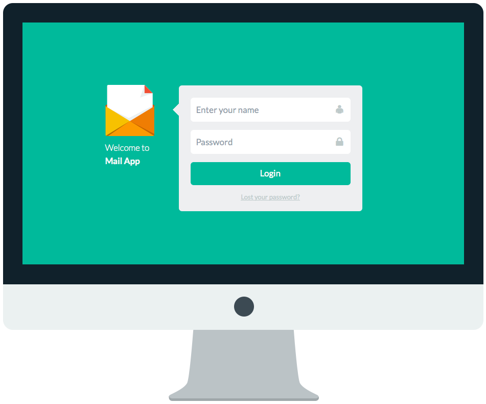
Flat design is a trend that has become increasingly prevalent in web design since Apple announced their changes to the soon to be released IOS 7. In case you’ve not heard of it, flat design is just as it sounds; design that is simple with no use of gradients or drop shadows or the skeuomorphic features that came with previous versions of IOS. Even that trend had many designers using gloss, bevels, stitching (Apple calendar anyone), coffee stains, ripped paper… you get the idea.
I’m enjoying the flat designs that are now appearing in web design. There are also an incredible number of free and paid resources to get you inspired and assist with your own designs like the free Flat UI kit from Designmodo.

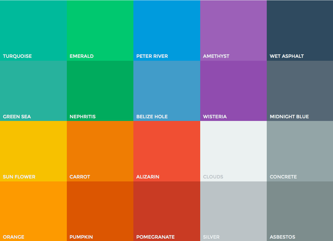
This Flat UI Color picker also comes courtesy of Designmodo. It gives you a great idea of the colours that are being used in many flat designs and it also lets you to view and quickly copy any of the colours in Hex, RGB and RGBA. I’m really loving the Sun Flower. Do you have a favourite?
Where I really love flat design though is when it’s combined with retro colours.

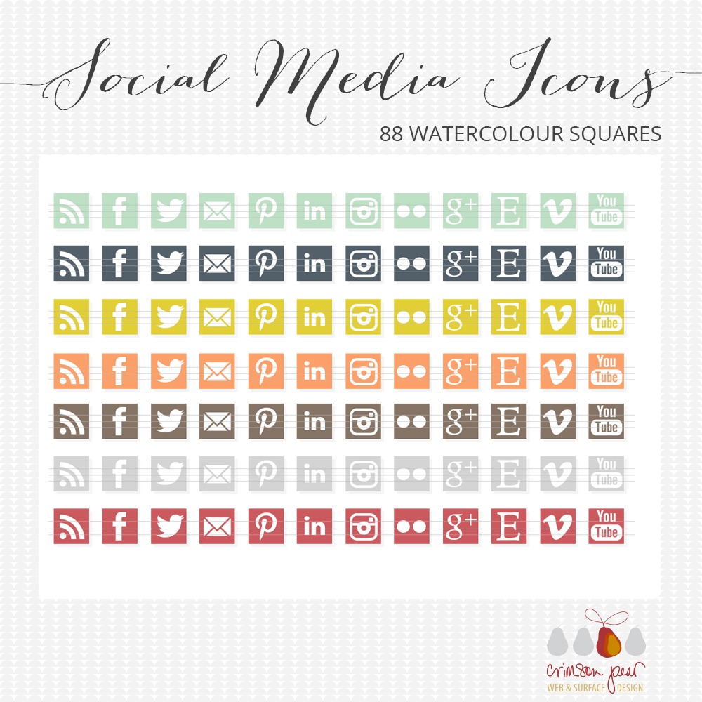
So I thought I would try my hand at designing some social media icons that were flat designs. These are now for sale on my web shop and on my Etsy store. I took a little inspiration from the Designmodo UI colour picker but I really wanted colours that were a little more subtle with a retro feel. I do like how they turned out and I’m thinking I might like to try my hand at a flat design WordPress theme. What do think of this trend?
Comments
One response to “Thinking about :: flat design”
I love flat design. It’s right up my alley and complimentary to my design style. Glad we’re done with the bubble and gloss. lol