I’ve been doing a lot of research this week. I’ve been seeing what trends are emerging in the web world as well as researching colour trends (more on that next week). In my extensive browsing I noticed a trend that is worrying and I wanted to share with you today some tricks for ensuring your blog or website is built for all.
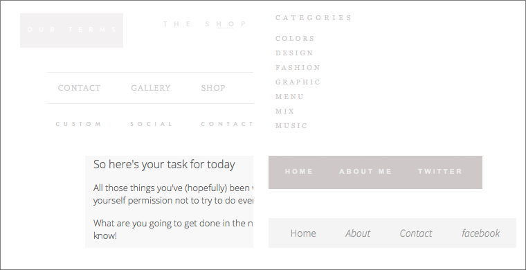
The image above shows snippets I collected in my research travels from different blogs. Can you see the trend? If you said super small muted text colours then you would be correct. Do you see the problem? How easy is this text for you read? Are you, like me, struggling to read that button in the top left? Yes, I wear glasses but even with those on the effort to read that on screen is equivalent to an eye exam. In fact each of these have insufficient colour contrast to conform to WCAG 2.0 AA.
If this is news to you, let me give you a little background. The Web Content Accessibility Guidelines (WGAG) are a set of documents that assist web designers, developers and writers create site content that is accessible by people with disabilities. The WCAG guidelines have 3 conformance levels A, AA & AAA. Most of us should be aiming for A at the very least. In my day job I work with a lot of Government and Education sites so they aim for AA conformance. There are few sites that will aim for AAA, except those that may want to based on the services they provide. The conformance levels are cumulative, which means to conform to AA you must also conform to A. There are many parts to the guidelines but today I just wanted to focus on colour contrast, which I should point out is not included in conformance level A.
So as I said each of my examples fails AA for colour contrast. What it tests is that a significant contrast (represented as a ratio) exists between the foreground colour and the background colour. There are variables to this though, which you may have already worked out. Sometimes the same contrast will not conform if the text is small, but will conform if the text size is increased. Are you surprised that the text block in the bottom left of my examples doesn’t conform?

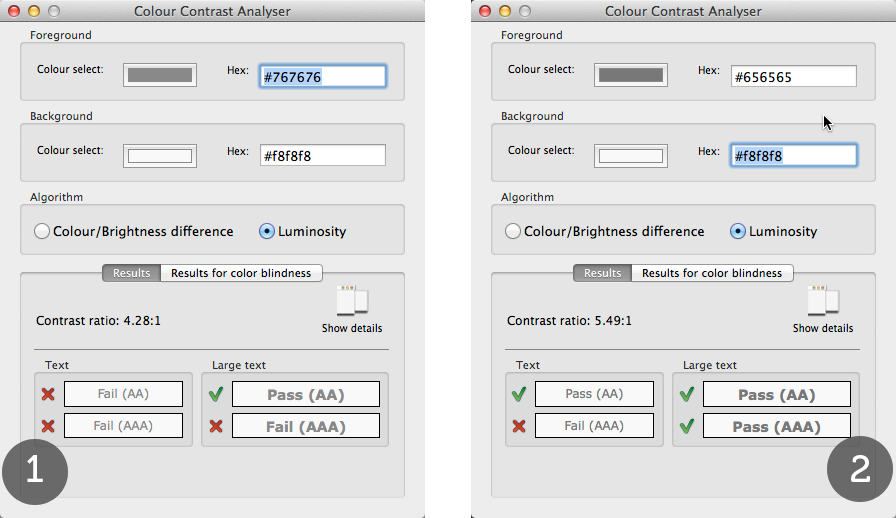
The tool I’m using here is the Color Contrast Analyzer that is available for download for Windows or Mac. I will provide you with links to a few more helpful tools and what each of them have in common is that you have to be able to determine the foreground and background colour by their hexadecimal code. Again there are a lot of tools to help you with this, I like to use ColorZilla, an Add On for Firefox, which provides an eyedropper that lets you select a colour on the screen. In my example above you can see that while this text fails when the text is small at both AA (#1), if I increase the foreground slightly, then I pass the test (#2).
Right now I suppose you are wondering why you should bother when it’s not a requirement for Level A. This is a very valid point, however I think it’s very clear in these examples that they are just plain difficult to read and that doesn’t make good design sense, even if you are not aiming for WCAG 2.0 conformance. Almost all of these examples I collected are navigation elements, their purpose is to assist me to navigate the site and my experience in this site could be severely impeded if I struggle to read the labels.
Remember, colour contrast is just one check you can do on your blog or site. It does provide a concrete result, a pass or a fail. Some things are a very grey area especially when we start talking usability and sometimes you just have to make a judgement call. On this blog the hyperlink colours also fail AA conformance so I’m off to find a green that I both love and conforms – wish me luck!
Here’s some more tools that work well:
Final thought: Designing and building a blog that conforms to accessibility guidelines means none of your readers are disadvantaged – win, win I say. If you are curious to have a review of your own blog or site and see how well it conforms – please get in touch.
P.S. I have not provided links to the blogs that I collected these from because they represent the artistic license of some talented designers. While I may not agree with their design decisions my intention is not to negatively impact their livelihood.

Comments
One response to “Thinking about :: colour contrast”
Great resources. Thanks Libby.